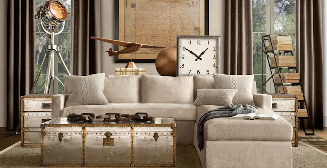
A couple days ago I got a catalog in the mail from Restoration Hardware so thick you would have thought it was the damn yellow pages. I was excited since I opened the page and saw my one of my favorite chandeliers by Halo Styles, but other than that I thought the catalog was a total bore. Don't get me wrong I love love love there stuff, but the way they styled their merchandise for the catalog shoot was just plain blahhh. I mean seriously a little COLOR couldn't hurt. I understand that they are doing this whole french country meets modern industrial with their beige linens and vintage reproductions, and they are wonderful, BUT would it hurt to throw some colorful flowers into the shoot or paint a wall a vibrant color. Even the flowers they used in the spaces were dull, and flowers should be anything but. Just see for yourself...
Again, they have mastered the tone on tone thing. Congratulations, but I'm getting bored at looking at your stuff in the same damn way every time.
Ahhh the lovely birdcage chandeliers, so much fun! Love the prints, BUT where's the color!!!
Snoooze!!
Such a cool over scale chandelier!! And you gotta love their outdoors stuff.
Beige Beige Beige
This desk and chair combo is pretty awesome, but where are the pretty books and accessories that go inside?
The stainless trunks are my fave, but again I couldn't get more bored with the styling.
Please people tell me what you think!!! We desperately want/need your feedback! Do you think I'm right here or not? I want to know who is reading us out there!!!
~N


