Monday, December 30, 2013

PORTFOLIO: Upper West Side Apartment


Nicole and I had a photo shoot this weekend for our clients home in the Upper West Side. There is so much excitement that happens while setting up for our photo shoots, from picking up last minute accessories, to picking up fresh treats at the bakery, to waking up at 6AM to scour through the NYC Flower District and carrying 6ft long cherry blossom branches on the subway that you just HAD to have. We (and most importantly, our client) could not be happier with the end results, we hope you enjoy the photographs as much as we do.


Check out the rest of our portfolio at dalliancedesign.com

Tuesday, December 17, 2013

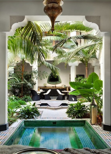
MOROCCAN ARCH


I have always been drawn to the structural elements of Moroccan Architecture such as domed ceilings, high, curved archways and keyhole-shaped naves. Morocco was influenced by the use of basic semi circle arches in Roman and Byzantine architecture. Naturally Moroccans developed more intricate and intriguing arch shapes such as the ogee, horseshoe, and pointed arch with each shape symbolizing something different such as "keeping evil out." 


Tuesday, December 10, 2013

PREPPY CHIC DESIGN CONCEPT


Here is a sneak peak at one of our latest design projects. With snow piling up outside, who doesn't want to curl up in some cozy warm wool plaid chairs or an olive green chesterfield sofa? We plan to photograph new projects within the upcoming weeks, we are so excited to show you what we have been keeping busy with. Be sure to check back for updates.
Stay warm,


Tuesday, December 3, 2013

PATTERN PLAY

If I had the luxury of purchasing a new sofa every couple of years, I would probably go all out and play with some pattern. But the idea of committing to a sofa thats a bit more "one direction" has me a tad reluctant. Chairs and even wallpaper are easy for me, but a patterned fabric on a sofa, not so much. As a designer I'm conflicted. On one side of the spectrum we should be taking more risks and setting the trends, but on the other hand most of us have design schizophrenia! How do you pick just one when you have a 100+ favorites? 

This project is in pattern overload! Although it totally works and I personally love it, I'm not sure I could live with this look for more than 2 years.
ISUWANEE Blog

More bold patterns, layered perfectly together. 
John Knott and John Fondas

I own this Kelly Wearstler Bengal Bazaar fabric in the lilac colorway, but in pillows! I adore them, but it's been two years and I'm already ready to switch them out. Easy fix I can afford. 
Rita Konig

Here are two examples I think I could live with. 
A simple stripe, always a classic...
Houzz

And a tone on tone pattern that feels more like a texture. 
I'm loving everything about this space!
Live Breathe Decor Blog

How do you feel about patterned fabric on your sofa?

Tuesday, November 26, 2013

NEWEST INSTALLATION

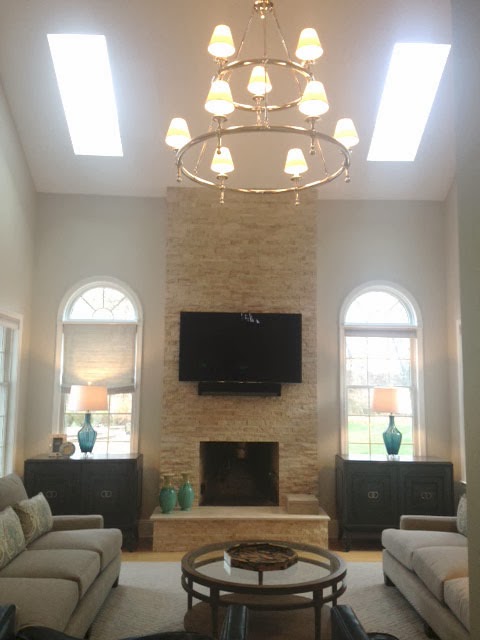
With the exception of a few missing elements (i.e. the gas fireplace insert, the other shades, and a mirror we are still waiting on) this family room is almost complete! And the owners couldn't be more thrilled about the turn out.

BEFORE
Although big and spacious, this room needed some serious comfort and surface retouching. And if there was one thing the client wanted to retouch it was that horrid fireplace! And we agreed of course, but the other fix I just had to persist on making was the lighting problem. There wasn't any! All they had was a ceiling fan and a couple drab table lamps, in a room with 20 foot high ceilings!!! Sky lights and fans are great for natural light and energy saving purposes, but in the dead of winter the fire would be the only thing lighting up! My point being made, they went for the chandelier and not only does it add proper lighting, but it's super gorgeous!


DESIGN CONCEPT
Steph and I initially went for a more transitional look for the client, but as we built on certain pieces the client ended up moving in a more sleek and contemporary direction. We also decided that taking the fireplace stone all the way up to the ceiling was the right decision in the end.


AFTER


So what do you think, big imporvement?

Thursday, November 7, 2013

THE SELF DEFENSE GIFT GUIDE

As a 25 year old young woman, living in New York City can be a bit intimidating at times. I've seen a few things on the train and on the streets that make me think I should take some self defense or kick boxing classes.
Mom, if you're reading this, don't worry I am fine and there is nothing to worry about. The important things to remember are to always be aware of your surroundings, and don't feel like you have to respond to every stranger who comes up to you out of politeness. I've rounded up some stylish safety gadgets that can help you feel safer walking the streets at night or having to take those late night train rides.


Thursday, October 24, 2013

AUTUMN INTERIORS

Not only do I get excited for fall fashion this time of year, but my personal interior design style is rooted in the autumn look as well. I guess it's that rustic modern aesthetic that really feels cozy to me. The warm wood tones, the sheepskin rugs, the foliage colors, rustic stone fireplaces, it's all my element. Yet to stay hip, I still need those metallic touches and sleek surfaces.  

Great idea in this first photo. Buy one chair and make two cushions in different colors and fabrics for the changing seasons. 
Zach Desart Photography

Natural barn wood and driftwood has been really prevalent lately, and I think it's here to stay for awhile. 
Rachel Halvorson

Rustic textures work really well with other modern materials and styles. Look at the dining table for example, the materials look industrial but the shape is really contemporary. I'm also pretty in love with that 5 arm chandelier in the adjacent room. 

Updated equestrian.

Could you imagine walking through this when the first snow fall happens?!


M. Elle Designs

Love the plum hues!!
M. Elle Designs

M. Elle Designs

Neptune Kitchens


Why not cover the fridge in some reclaimed wood and slap on some ridiculous hardware. Yes!

Tuesday, October 1, 2013

KEN FULK: MASTER STYLIST

I recently saw this image below and I was floored. Anyone who rocks an emerald green lacquer wall with exposed brick is just a freakin GENIUS. Seriously, mind blown. Soooo obviously I needed to check out the person who made it happen, Ken Fulk. I've heard the name before, but I really needed to see what he was all about. And what I found was a gold mine of interior perfection. Sexy, cheeky, luxurious and fun, Ken knows how to put a room together....and apparently a party or two. The man knows how to live. 


Honestly, I could barely narrow down the expansive selection of portfolio shots, so bare with me. You will not be disappointed. 


His interiors are a constant reminder to not take ourselves too seriously. 

I love Fulk's use of vintage items and interesting light fixtures. Never afraid to mix it up! 


He definitely has a thing for taxidermy. 


This sectional is fab. 


Need those cerulean chesterfields!
From rustic to victorian, moroccan to modern, Ken Fulk can transform any space.